Dimensionality Reduction & PCA
Lecture 32
Which One is Compressed?


Which One is Compressed?
Visualizing Plane
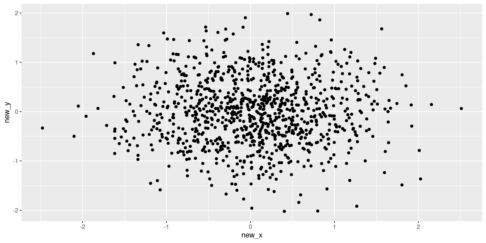
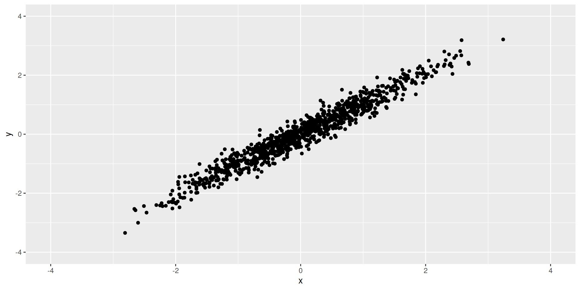
Visualizing 2D
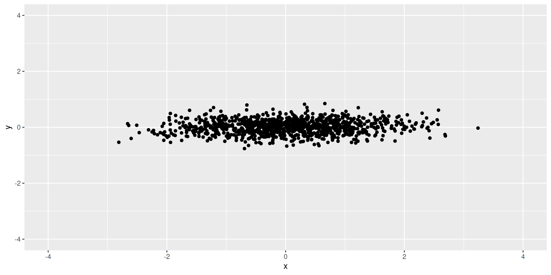
Visualizing 1D
Visualizing 1D Data
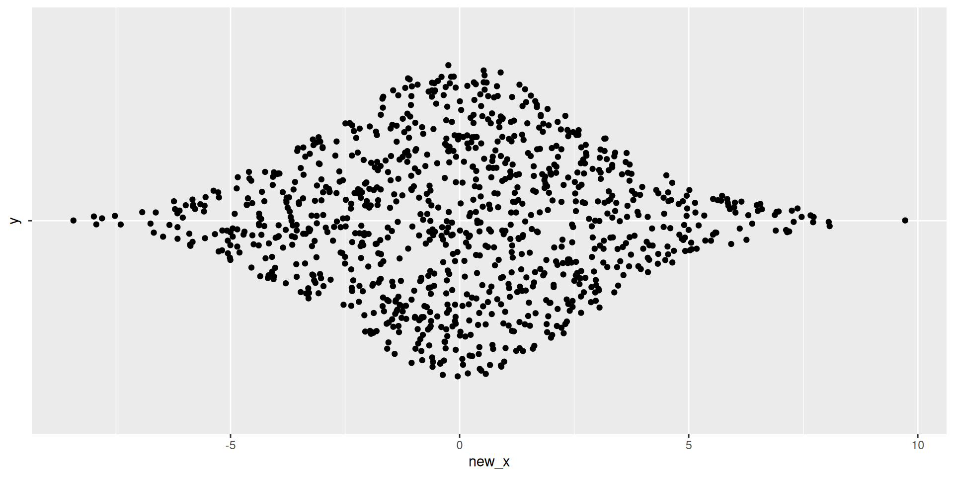
Visualizing Plane
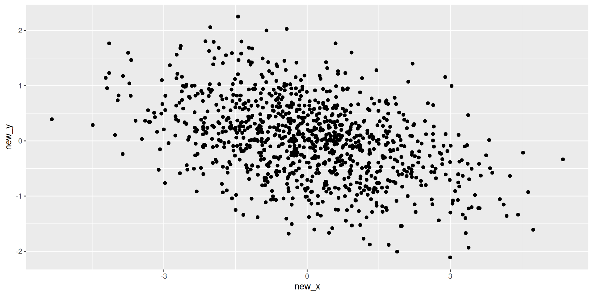
Plotting these
Easy Example
- Exercise: What should the first and second PCs be?
Harder Example
- Exercise: What should the first and second PCs be?
Scatterplot of PC1 vs PC2
- The most common PCA plot.
- Points close together are “similar” in the original high-dimensional space.
Code
# Since we removed 'species' in the recipe to avoid using it in PCA,
# we might want to bind it back for plotting coloring.
# A better workflow is to keep it as an ID/Role but not utilize it in step_pca.

pca_rec_2 <- recipe(species ~ ., data = penguins) |>
  step_rm(year, sex, island) |>
  step_naomit(all_predictors()) |>
  step_normalize(all_numeric_predictors()) |>
  step_pca(all_numeric_predictors(), num_comp = 2)
  # Default behavior: step_pca ignores 'outcome' variables, which is handy!

pca_prep_2 <- prep(pca_rec_2)
pca_juice <- juice(pca_prep_2) # juice() is a shortcut for bake(prep, new_data=NULL)

ggplot(pca_juice, aes(x = PC1, y = PC2, color = species)) +
  geom_point(size = 3, alpha = 0.8) +
  theme_minimal() +
  labs(title = "Penguins PCA", subtitle = "Species separate well in PC space")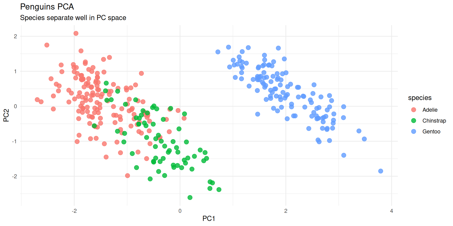
Loadings: What do the PCs mean?
- Loadings: The contribution of each original variable to the PC.
- We can extract them from the prepped recipe using
tidy().
Code
pca_comps <- tidy(pca_prep_2, number = 2, type = "coef") # number=2 refers to the step number index if unknown, typically easier to look up.
# Better way: ID the step
pca_rec_named <- recipe(species ~ ., data = penguins) |>
  step_naomit(all_predictors()) |>
  step_normalize(all_numeric_predictors()) |>
  step_pca(all_numeric_predictors(), id = "pca")

pca_prep_named <- prep(pca_rec_named)
pca_comps <- tidy(pca_prep_named, id = "pca")

pca_comps |>
  filter(component %in% c("PC1", "PC2")) |>
  ggplot(aes(x = value, y = terms, fill = terms)) +
  geom_col() +
  facet_wrap(~component) +
  theme_minimal() +
  theme(legend.position = "none") +
  labs(title = "PCA Loadings: Contribution of variables")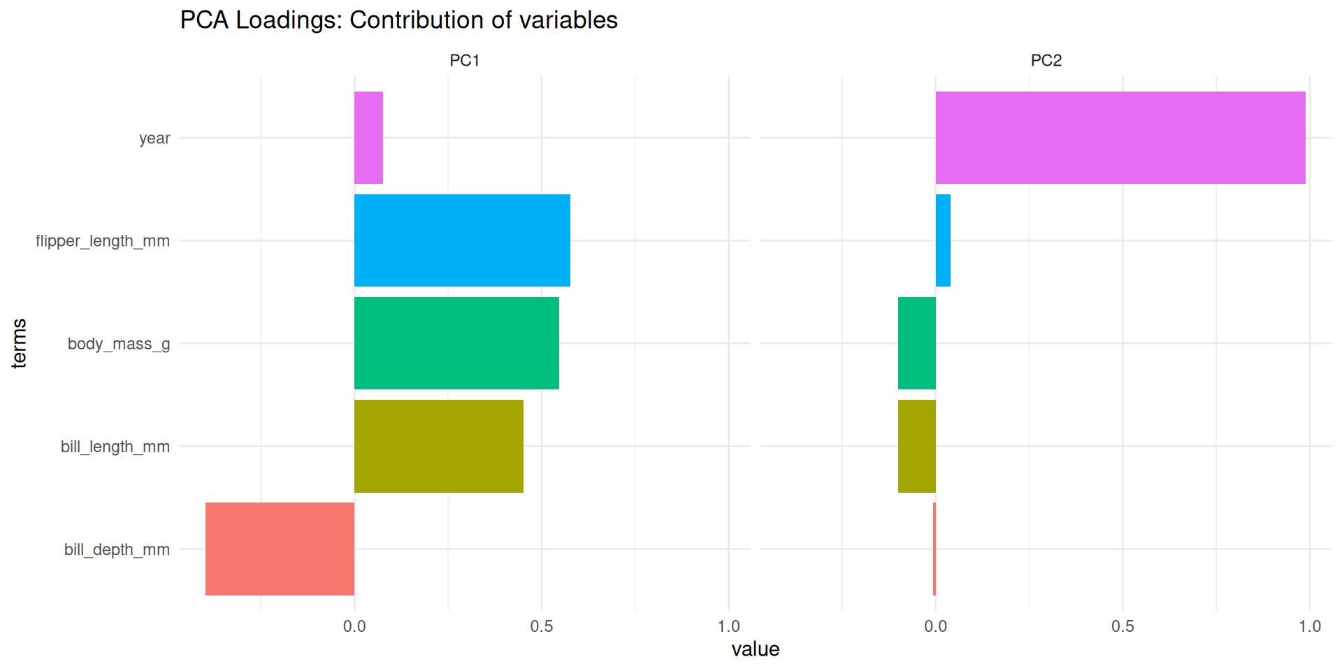
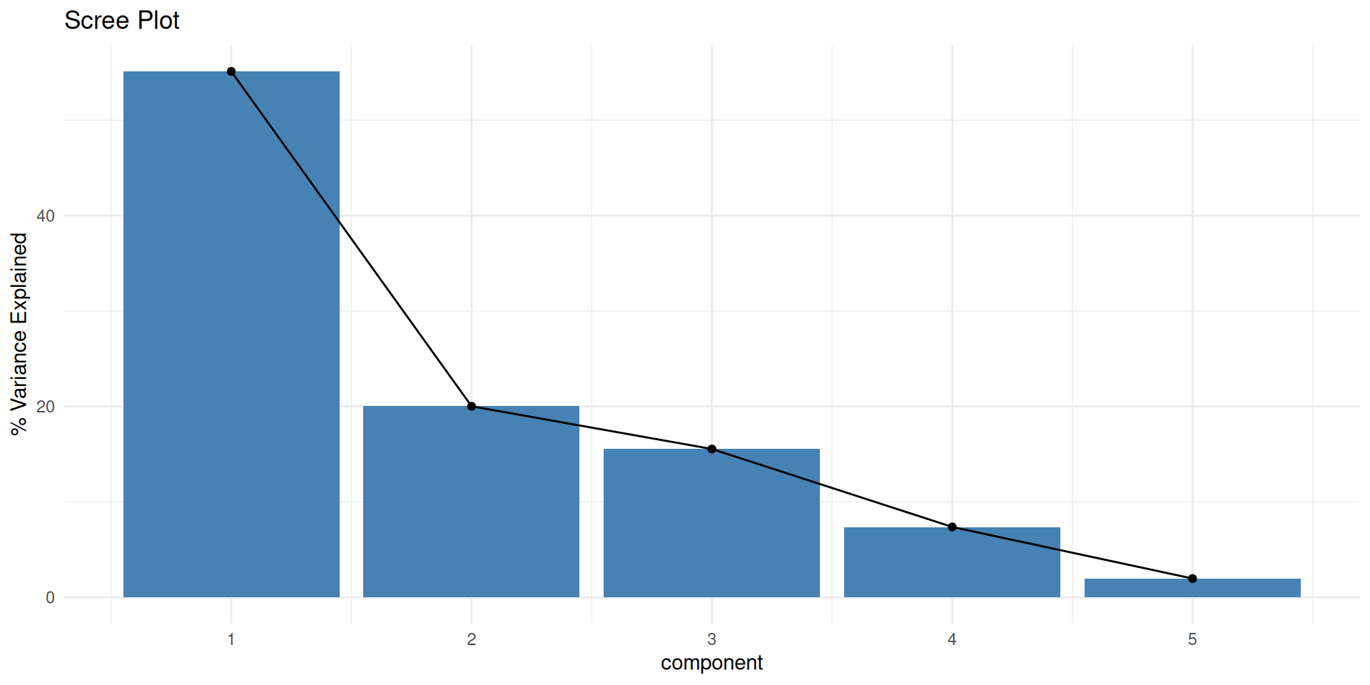
Scree Plot: How many PCs?
- How much variance is explained by each component?
Code
# Extract variance explained
pca_var <- tidy(pca_prep_named, id = "pca", type = "variance")

pca_var |>
  filter(terms == "percent variance") |>
  ggplot(aes(x = component, y = value)) +
  geom_col(fill = "steelblue") +
  geom_line(group = 1) +
  geom_point() +
  labs(title = "Scree Plot", y = "% Variance Explained") +
  theme_minimal()