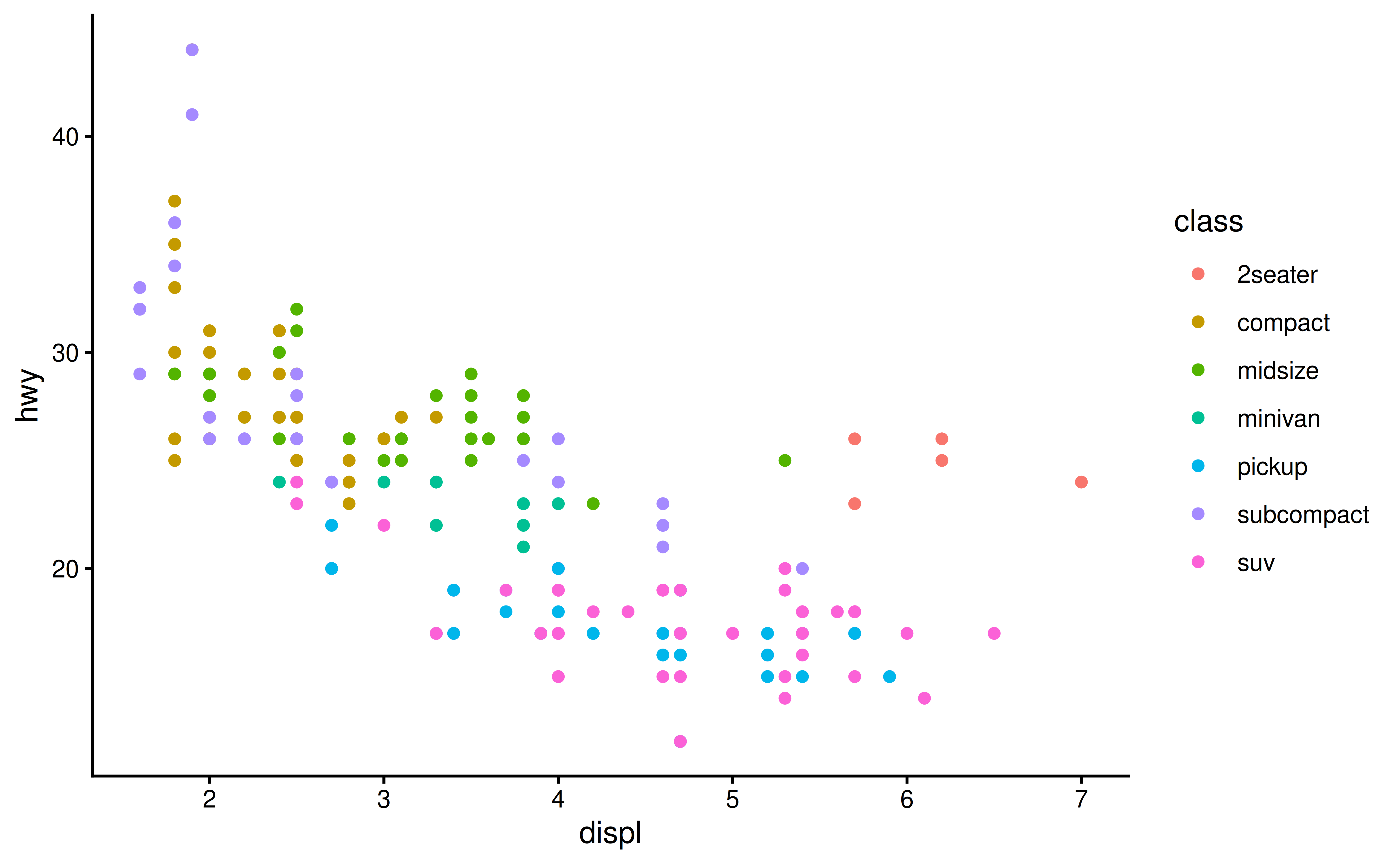
ggplot(mpg, aes(x = displ, y = hwy)) +
  geom_point(aes(color = class)) +
  geom_smooth(se = FALSE) +
  labs(
    title = "Fuel efficiency generally decreases with engine size",
    subtitle = "Two seaters (sports cars) are an exception because of their light weight",
    caption = "Data from fueleconomy.gov",
    x = "Engine displacement (L)",
    y = "Highway fuel efficiency (mpg)",
    color = "Car type"
)Communication
Lecture 9
labs()
- Use the
labs()function to add labels to your plot. - You can add a
title,subtitle,caption,tag, and newxandyaxis labels.
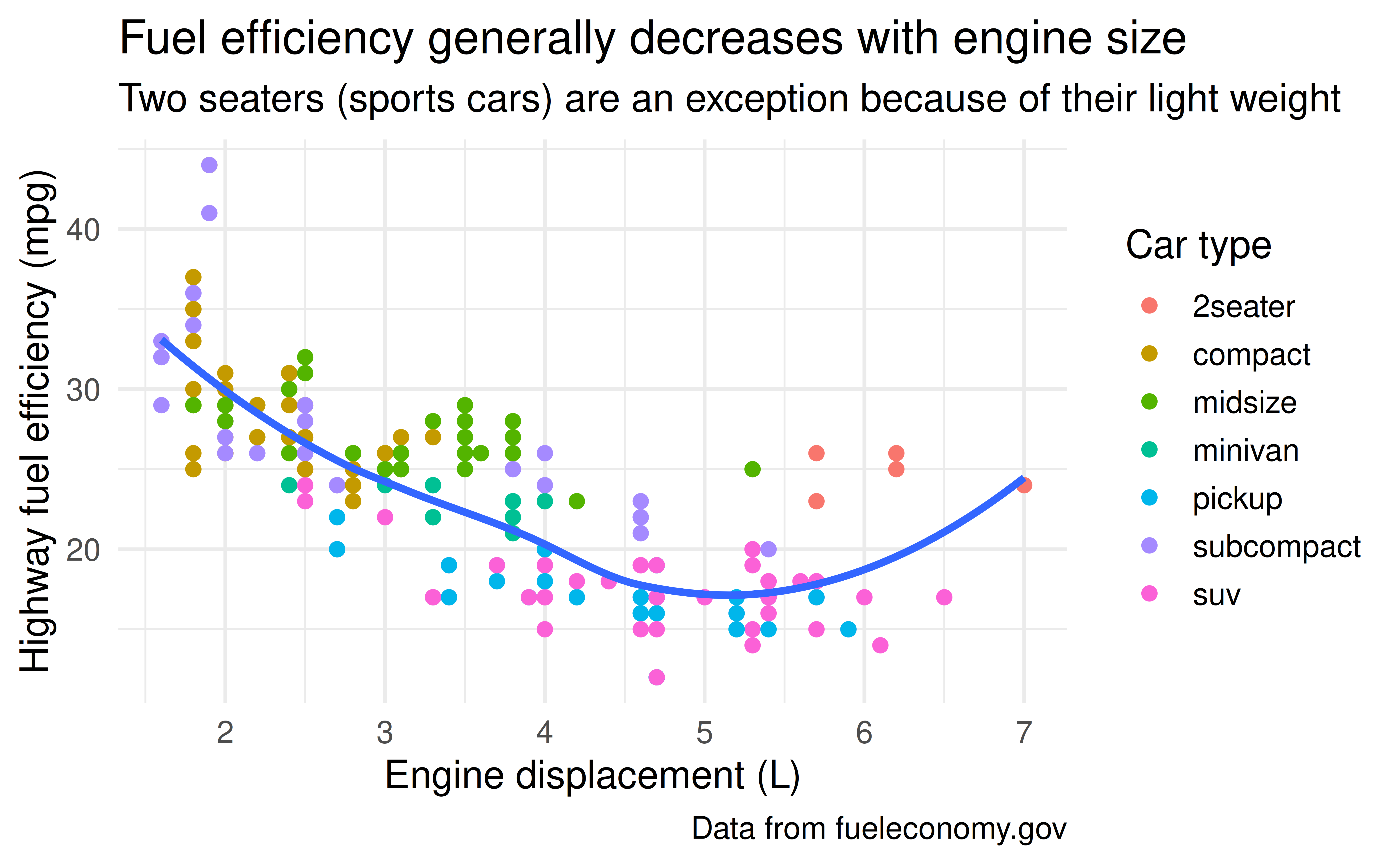
Example
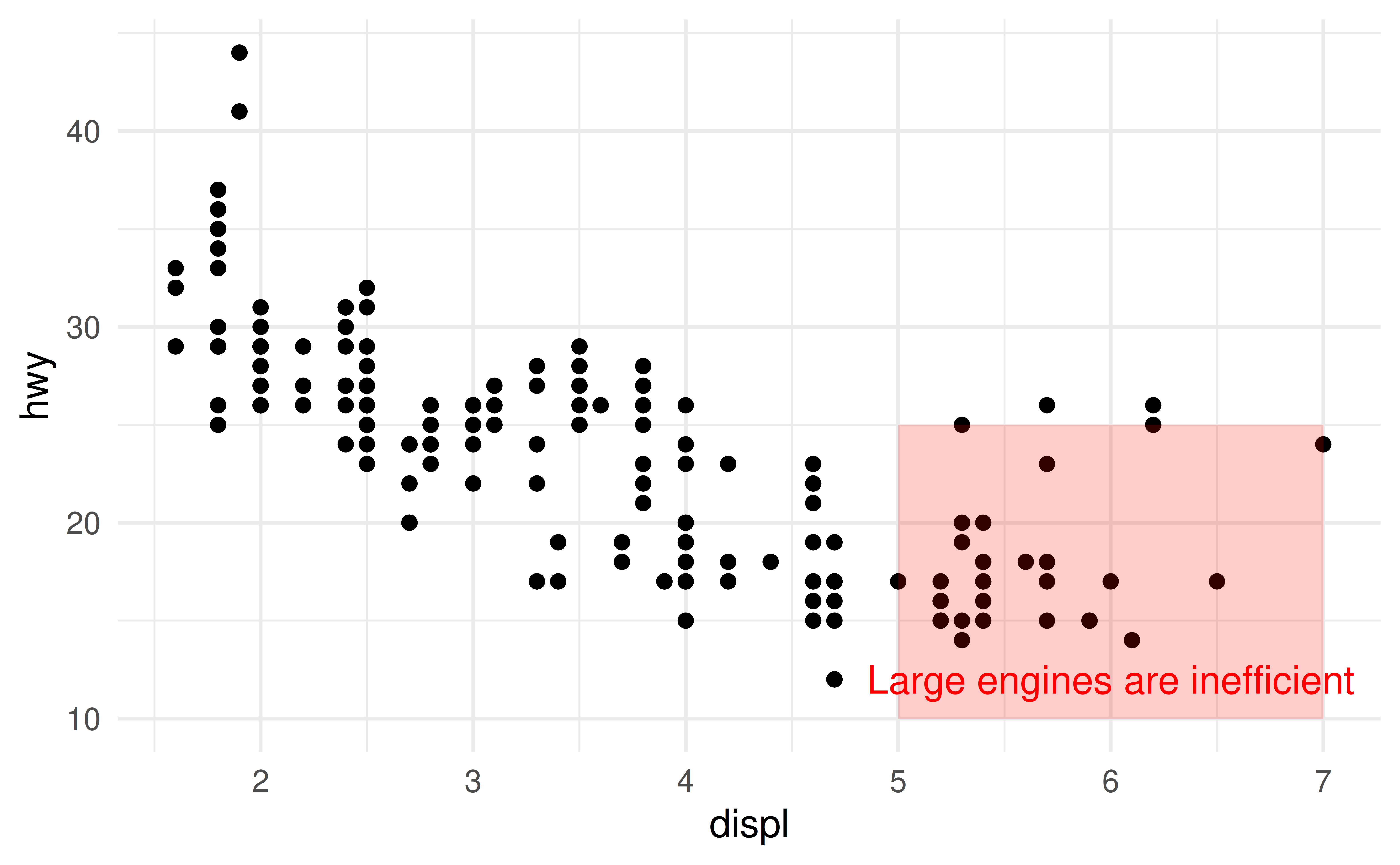
Example: Ticks
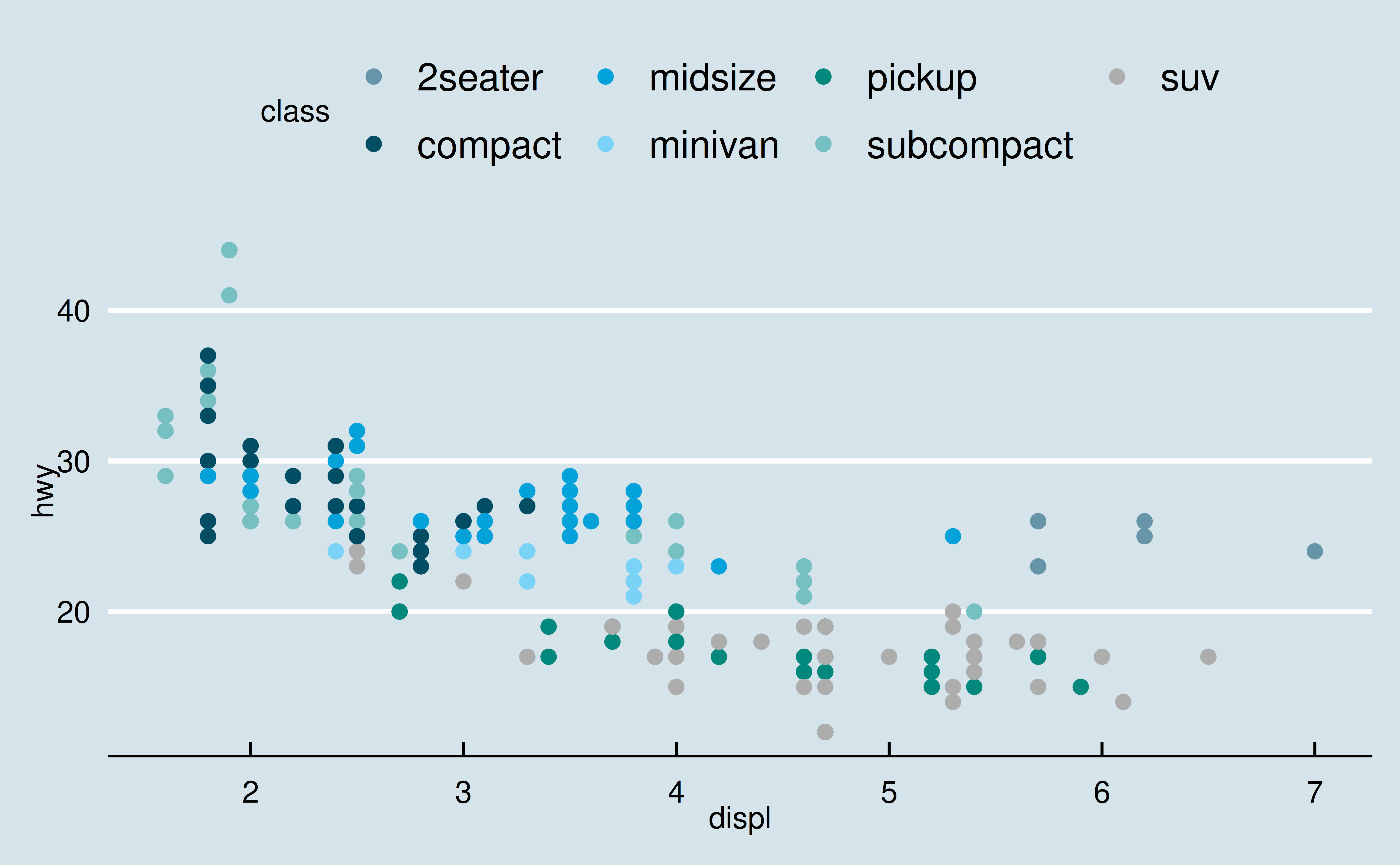
Example: Legend
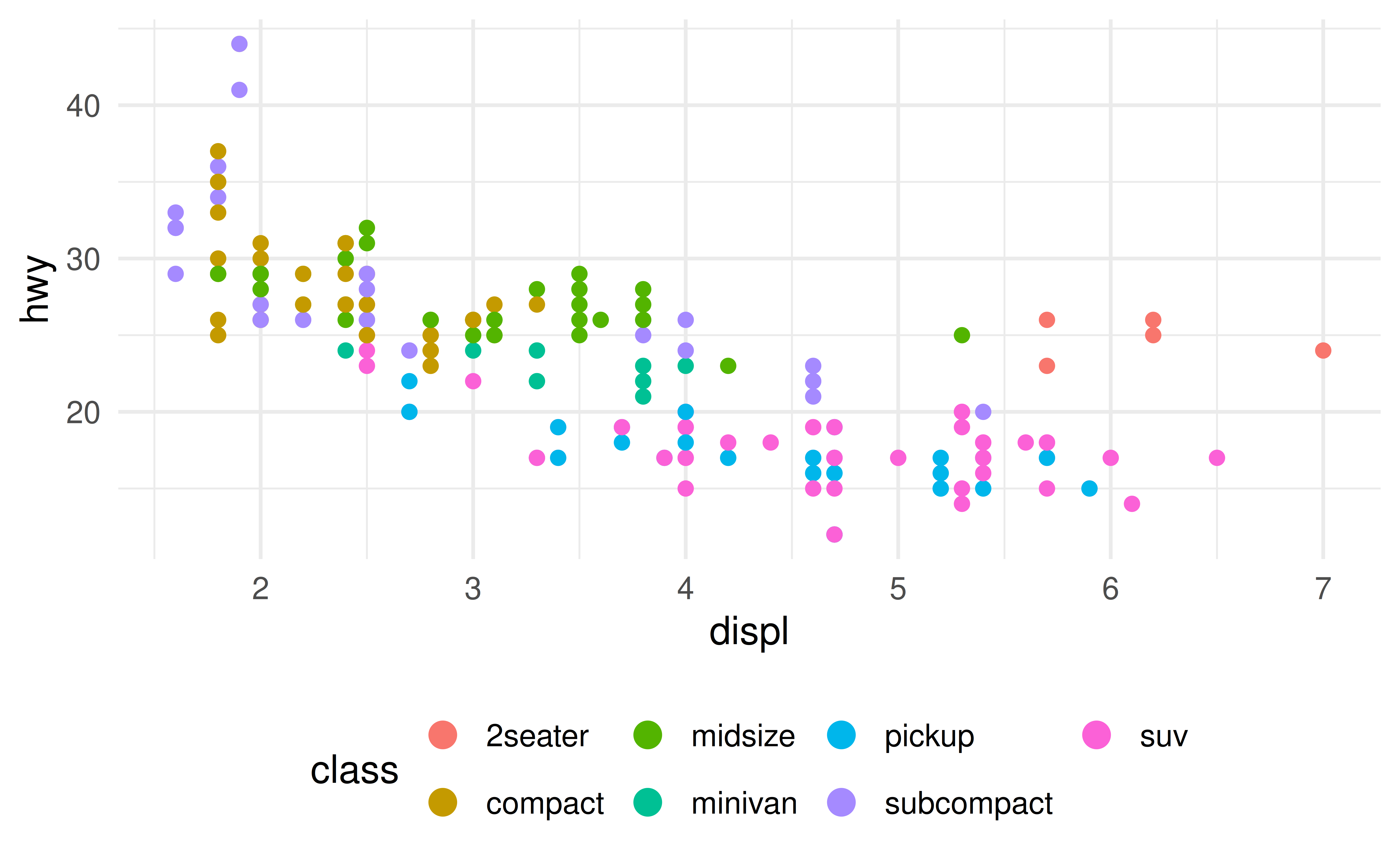
Example: Color Brewer
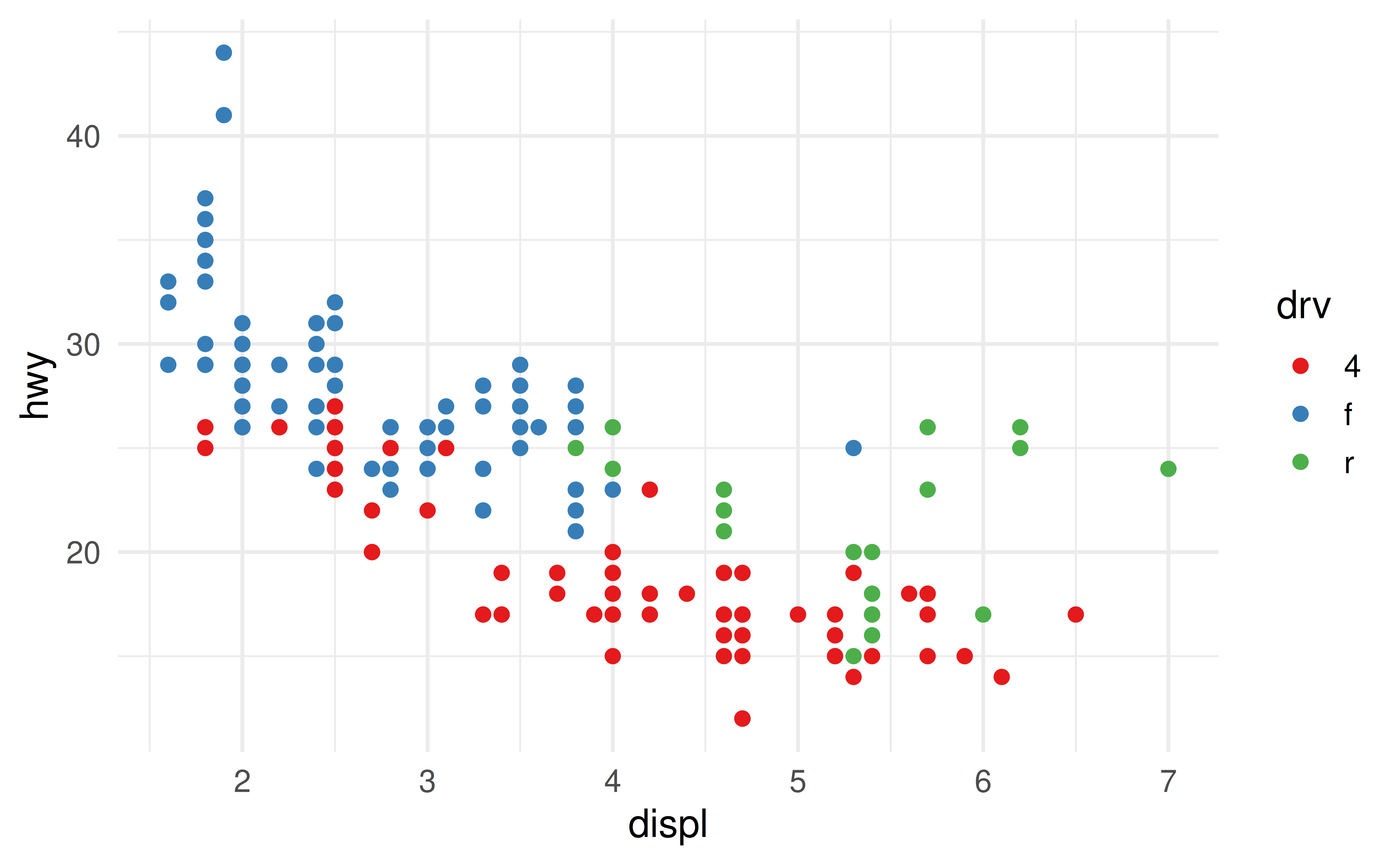
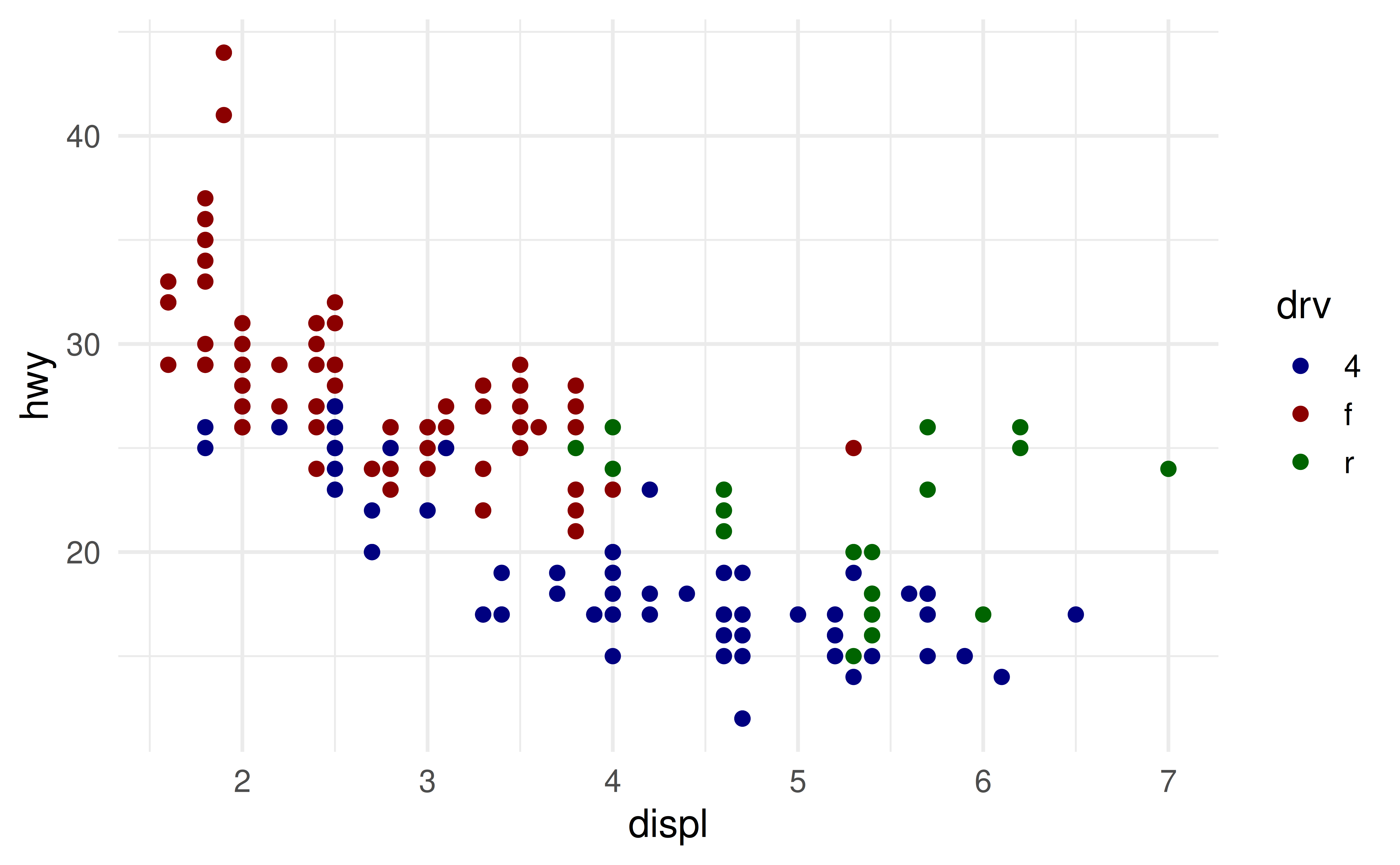
Manual Color Scale
- When you have a predefined mapping between values and colors, use
scale_color_manual().
Example
Example
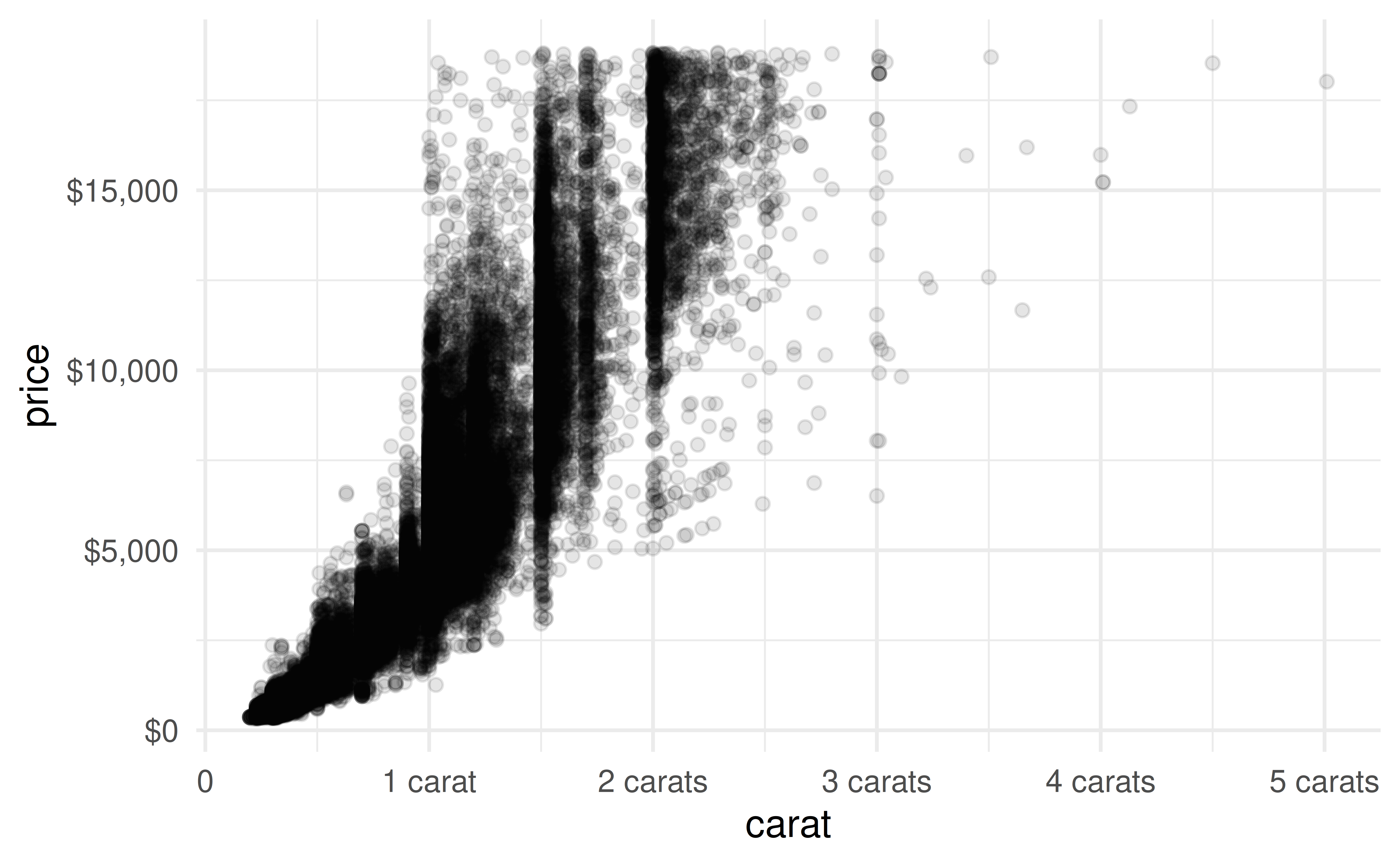
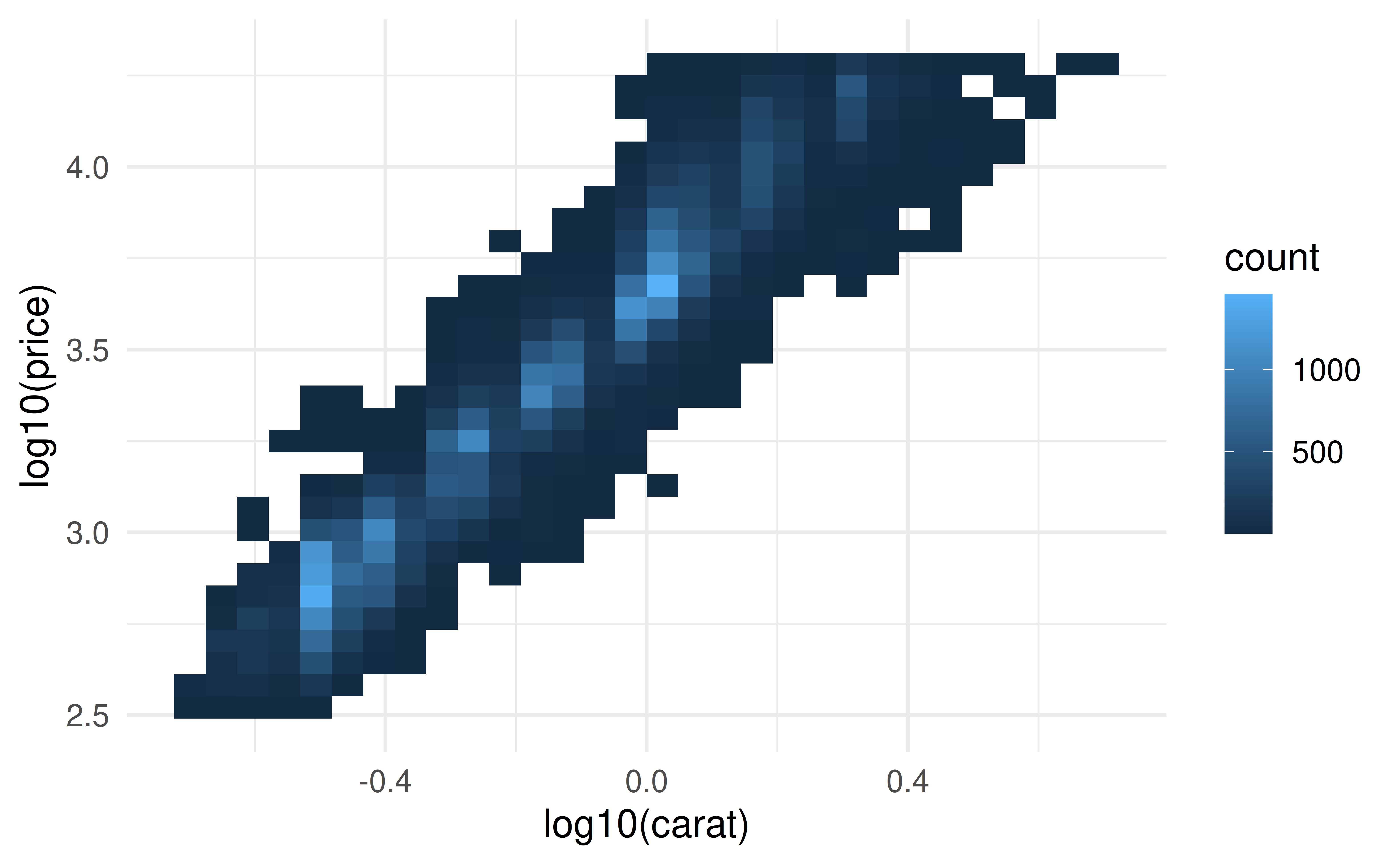
Code
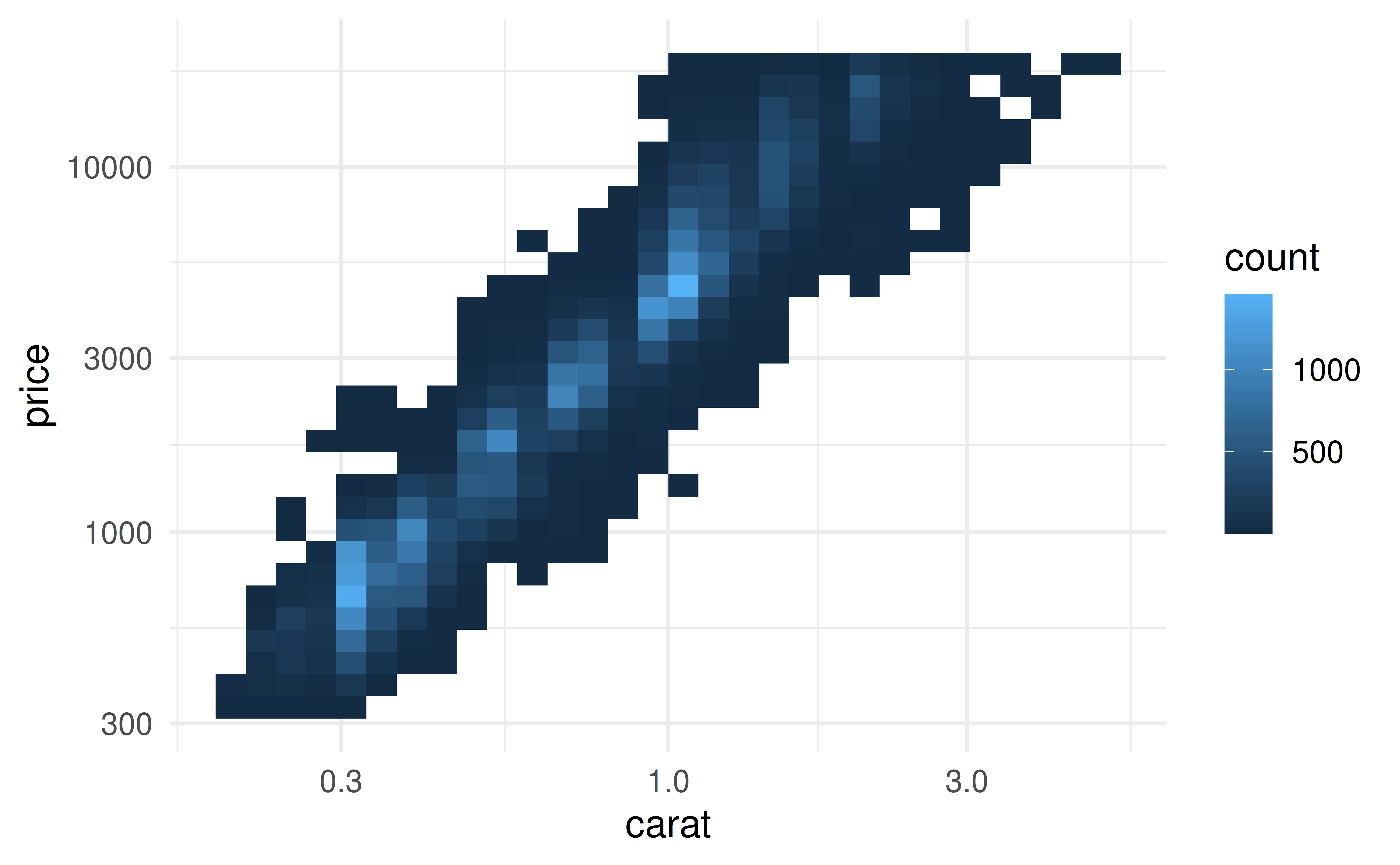
p1 <- ggplot(diamonds, aes(x = carat, y = price)) +
  geom_point(alpha = 0.1)

p2 <- ggplot(diamonds, aes(x = carat, y = price)) +
  geom_point(alpha = 0.1) +
  coord_cartesian(xlim = c(0, 1), ylim = c(0, 5000))

p3 <- ggplot(diamonds, aes(x = carat, y = price)) +
  geom_point(alpha = 0.1) +
  coord_cartesian(xlim = c(0, 0.5), ylim = c(0, 3000))

p1 + p2 + p3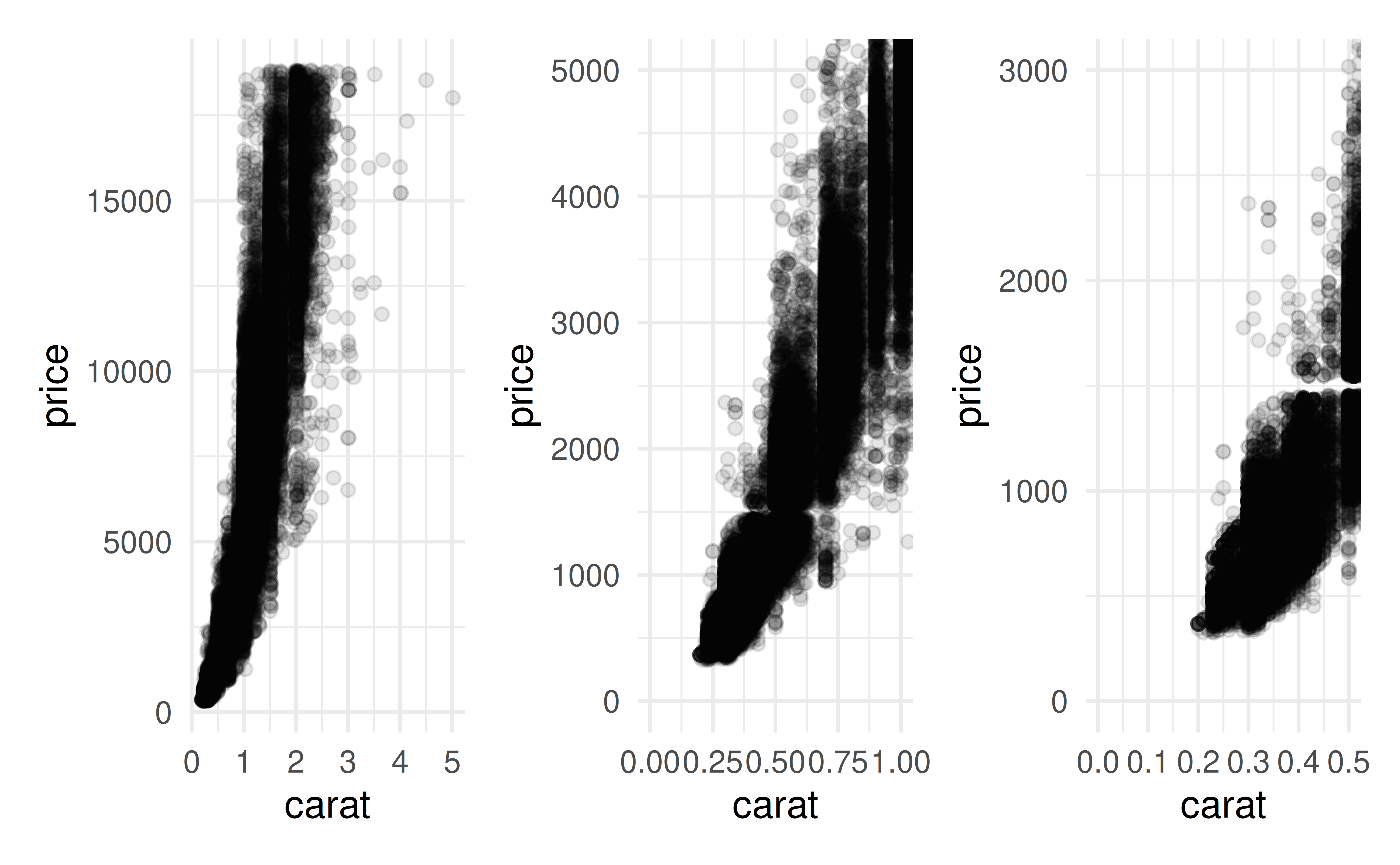
Example
Example